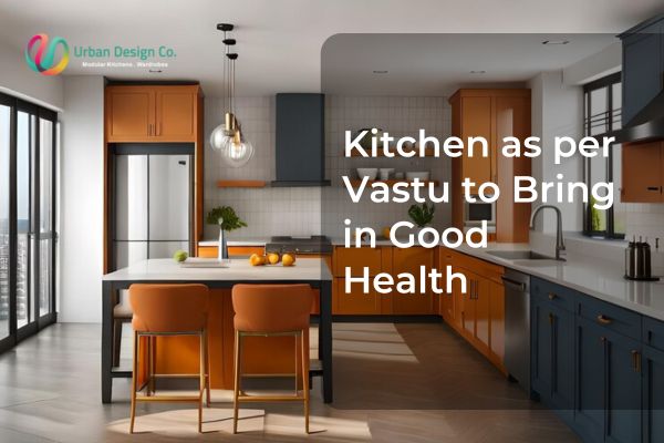
06
MarVastu Shastra, an ancient Indian architectural science, plays a crucial role in harmonizing the energies within a home. The kitchen, being the heart of the house, holds great importance in Vastu. It is the place where food is prepared, influencing the health, well-being, and prosperity of the family. The right placement, design, and especially colours in the kitchen as per Vastu can enhance positive vibrations, promote happiness, and ensure a harmonious environment.
Colours impact our emotions, mindset, and energy levels. In Vastu, each colour represents an element, fire, earth, water, air, and space. Since the kitchen is primarily governed by the fire element, choosing the right shades becomes essential. The right colours not only boost the mood of the people cooking but also create an atmosphere that fosters good digestion, joy, and abundance. Urban Design Co., a leading name in modular kitchens in Gurgaon, integrates Vastu-friendly designs to create functional and aesthetically pleasing kitchen spaces.
In this blog, we will explore the best Vastu colours for your kitchen, their significance, placement, and colours to avoid for a balanced and prosperous home.
Kitchen Colours as per Vastu
When selecting a kitchen colour scheme, it is essential to balance aesthetics with Vastu principles. The following colours are considered most suitable for a kitchen as per Vastu.
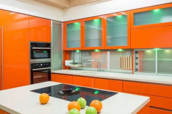
1. Red & Orange: Energy and Warmth
-
Significance: Red and orange are associated with fire, making them powerful choices for the kitchen. They symbolize passion, energy, and warmth, which helps in stimulating appetite and enthusiasm.
-
Best Placement: These colours work well for cabinets, tiles, or accents. However, excessive use may create aggression or restlessness. Using these shades in moderation is recommended.
-
Combinations: Pairing red or orange with neutral tones like white or beige can balance the intensity and create a vibrant yet soothing environment.
2. Yellow: Happiness and Positivity

-
Significance: Yellow is known for bringing brightness, optimism, and positive energy. It is linked to nourishment, making it a perfect colour for a Vastu-compliant kitchen.
-
Best Placement: Yellow works well for walls, backsplashes, or even kitchen accessories.
-
Combinations: Combining yellow with white or green enhances harmony and provides a fresh, uplifting vibe.
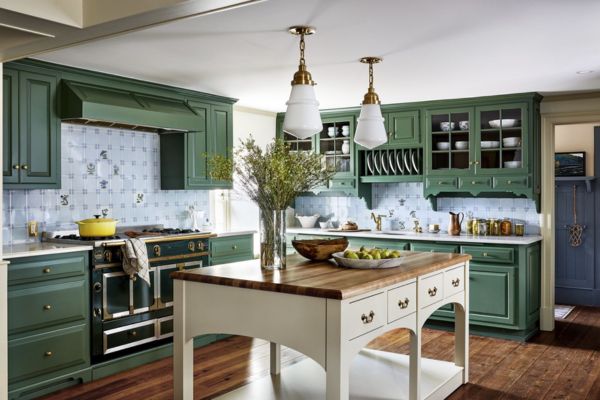
3. Green: Health and Freshness
-
Significance: Green represents nature and symbolizes balance, growth, and healing. It promotes good digestion and a calming ambiance in the kitchen.
-
Best Placement: Green is ideal for wall colours, plants, kitchen tiles, or cabinets.
-
Combinations: A mix of green with brown or beige adds an earthy touch and blends well with wooden textures.
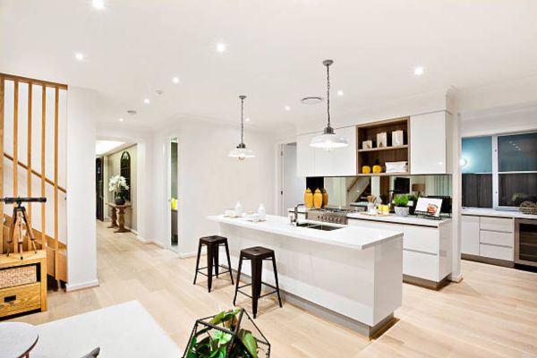
4. White: Purity and Cleanliness
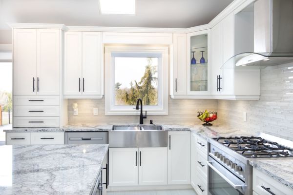
-
Significance: White symbolizes peace, clarity, and hygiene. It reflects light, making the kitchen look more spacious and organized.
-
Best Placement: White is perfect for walls, ceilings, countertops, and cabinets.
-
Combinations: To avoid a dull appearance, pair white with warm shades like yellow or wooden tones.
5. Brown & Wooden Shades: Stability and Comfort
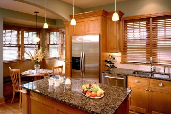
-
Significance: Earthy tones like brown promote grounding, stability, and warmth, making the kitchen feel cozy and welcoming.
-
Best Placement: Wooden finishes work well for cabinets, flooring, or dining areas.
-
Combinations: Wooden textures blend well with green, white, and beige for a natural, balanced feel.
Colours to Avoid in the Kitchen as per Vastu
While some colours enhance positivity, others can bring unwanted energy, stress, or imbalance. Some of the shades that you should avoid in the kitchen.
1. Black & Grey: Absorbs Negative Energy
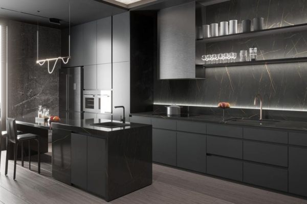
-
Why to Avoid: Black and grey absorb energy, creating a dull and uninviting atmosphere. These colours are linked to negativity, confusion, and stress, making them unsuitable for a kitchen.
-
Alternatives: If you prefer darker tones, opt for dark brown or navy blue in small amounts instead of black or grey.
2. Dark Blue: Water Element Conflict
-
Why to Avoid: Dark blue represents the water element, which contradicts the fire element of the kitchen. This imbalance can cause disharmony in family relationships.
-
Alternatives: Use lighter shades of blue in small accents or mix them with warm colours like yellow or beige to balance the energy.
3. Dark Purple & Excessive Dark Shades
-
Why to Avoid: These shades can create an overly heavy or intense environment, affecting the positivity of the space.
-
Alternatives: Lighter shades like lavender or pastel purple can be used sparingly if preferred.
Placement and Colour Combinations for Kitchen Elements
Apart from choosing the right colours, their placement also plays a crucial role in maintaining a harmonious kitchen as per Vastu. With Urban Design Co. you can customize modular kitchen solutions with carefully selected colours, from warm wooden finishes to vibrant cabinets in Vastu-approved sha-des. Let's get into where to use each colour for maximum benefits:
1. Walls and Ceiling
-
Best Colours: White, light yellow, or pastel shades.
-
Why? These shades enhance space, brightness, and cleanliness while keeping the energy balanced.
2. Cabinets & Shelves
-
Best Colours: Wooden finishes, red, orange, or soft yellow.
-
Why? These colours add warmth and complement the kitchen’s fire element.
3. Countertops
-
Best Colours: White, beige, brown, or light grey.
-
Why? These shades enhance hygiene and make the kitchen look spacious.
-
Avoid: Black countertops as they attract negativity.
4. Flooring
- Best Colours: Light brown, beige, or wooden textures.
- Why? These colours provide stability and an earthy feel, balancing the kitchen’s energy.
5. Dining Area (if part of the kitchen)
-
Best Colours: Yellow, green, or wooden tones.
-
Why? These shades enhance warmth, comfort, and togetherness during meals.
Additional Vastu Tips for a Balanced Kitchen
To make your kitchen more Vastu-compliant, follow these additional tips:
1. Ideal Placement of the Kitchen
-
The southeast direction is the best location for a kitchen as per Vastu since it aligns with the fire element.
-
A well-organized kitchen ensures a smooth flow of positive energy.
-
Avoid storing broken appliances or unnecessary clutter, as they attract negativity.
2. Ventilation and Lighting
-
Proper ventilation helps remove negative energy and ensures a fresh environment.
-
Natural light and bright lighting enhance positivity.
3. Position of the Cooking Stove
-
The cooking stove should be placed in the southeast corner, and the person cooking should face east to attract positive energy.
Conclusion
The right colours for your kitchen as per Vastu can significantly impact your home’s energy, health, and happiness. While warm and earthy tones like red, yellow, green, and white enhance positivity, certain colours like black, dark blue, and grey should be avoided to prevent negativity.
By carefully choosing your kitchen’s colour palette and following proper Vastu guidelines, you can create a space that fosters nourishment, joy, and prosperity. For those looking to incorporate Vastu principles into their modular kitchen, Urban Design Co. offers a range of designs tailored for health, happiness, and prosperity. Whether you are designing a new kitchen or planning a makeover, small yet effective changes in colour schemes can lead to long-lasting benefits.