13
AprLet’s be honest about the living room. When you enter the front door after a protracted workday, or while guests come over for a weekend dinner, the hall is the first aspect all of us see. It includes the weight of first impressions, but it also has to be snug enough for you to crash on the couch on a lazy Sunday. Getting your colour combination in hall areas properly is a massive deal because the paint sets the mood for the whole place. As a leading modular kitchen manufacturer in gurgaon, we’ve seen how a beautiful kitchen can be let down by clashing wall colours in the adjoining hall. The paint is the canvas, and our woodwork is the art.
If the wall senses cold, the room feels unwelcoming, no matter how a whole lot you spend on the furnishings. If the walls are too loud, the space feels chaotic. At Urban Design Co., while we specialise in crafting the custom woodwork that defines your home, like stunning LCD panels and open kitchens, we know that our cabinetry only looks its best against the right background. People frequently pick a colour card they noticed online, slap it on their walls, and then marvel why their room looks nothing like the Pinterest picture. The fact is, locating a great wall colour combination for hall layouts requires considering Indian lighting, dirt, condo size, and your current furniture.
If you're stuck watching white partitions and thinking what to do next, we have put together a tremendously realistic manual to help you out.
10 Trending Hall Colours Combinations You Should Actually Try
Trends change every few years, but some pairings just work. We chose these specific palettes because they look great in real homes and provide the perfect backdrop for custom interior woodwork. Here are 10 of the most reliable hall colors combinations you can use right now.
1. Teal and Crisp White
Teal brings a lot of personality to a room without making it feel dark. It is a bold mix of blue and green that looks incredibly rich. But in a standard apartment, painting the whole room teal will make it feel like a cave. That is why you pair it with a very sharp, crisp white on the ceiling and the remaining walls.
- Make it work: This is one of those hall colors combinations that form the ultimate background for a custom-built, wooden LCD panel. If you install an oak or walnut-finish TV unit from our portfolio against a teal wall, the wood grain pops beautifully against the cool tones of the paint.
2. Terracotta and Warm Beige
If you want your house to feel warm, grounded, and slightly rustic, terracotta is the way to go. It reminds us of baked clay and traditional Indian architecture. However, instead of pairing it with a stark white, use a soft, warm beige. The beige stops the contrast from being too sharp and keeps the room feeling cozy.
- Make it work: This wall colour combination for hall areas is all about earthy texture. It looks fantastic if your hall extends into a passage lined with a matte-finish sliding wardrobe. The terracotta walls bring a natural warmth that complements minimalist, neutral cabinetry.
3. Mustard Yellow and Soft Grey
Yellow is a tricky colour. It is bright and full of energy, but a bright yellow room can easily look like a school classroom. The trick is to pick a darker, earthier mustard yellow and pair it with a flat, soft grey. The grey absorbs the extra brightness of the mustard, making the whole setup look grown-up and modern.
- Make it work: Paint the main wall behind your television mustard, and keep the rest grey. When we design sleek, charcoal or black-finish LCD panels for a room like this, the dark woodwork against the mustard creates a sharp, highly modern edge.
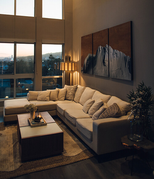
4. Navy Blue and Ivory
Navy blue is classic for a reason. It hides scuff marks (great if you have kids), and it makes any room look instantly more expensive. But again, you need to balance the dark tone. Ivory is much better than pure white here because ivory has a slight yellow undertone that warms up the coldness of the navy.
- Make it work: This is the perfect background if your living room opens directly into your dining space or kitchen. A navy accent wall creates a luxurious anchor point that contrasts brilliantly with white or light-wood cabinetry.
5. Olive Green and Cream
Bringing a bit of the outdoors inside is a great way to make a city apartment feel more relaxing. Olive green is muted enough that it doesn't hurt your eyes, and when you pair it with a creamy off-white, the room feels incredibly calm.
- Make it work: This palette begs for natural materials. If your living room features an open layout with an attached powder room, consider how the olive green hall walls will transition into the bathroom. A warm, wooden vanity design from Urban Design Co. inside that powder room will carry the natural, earthy theme straight through the house.
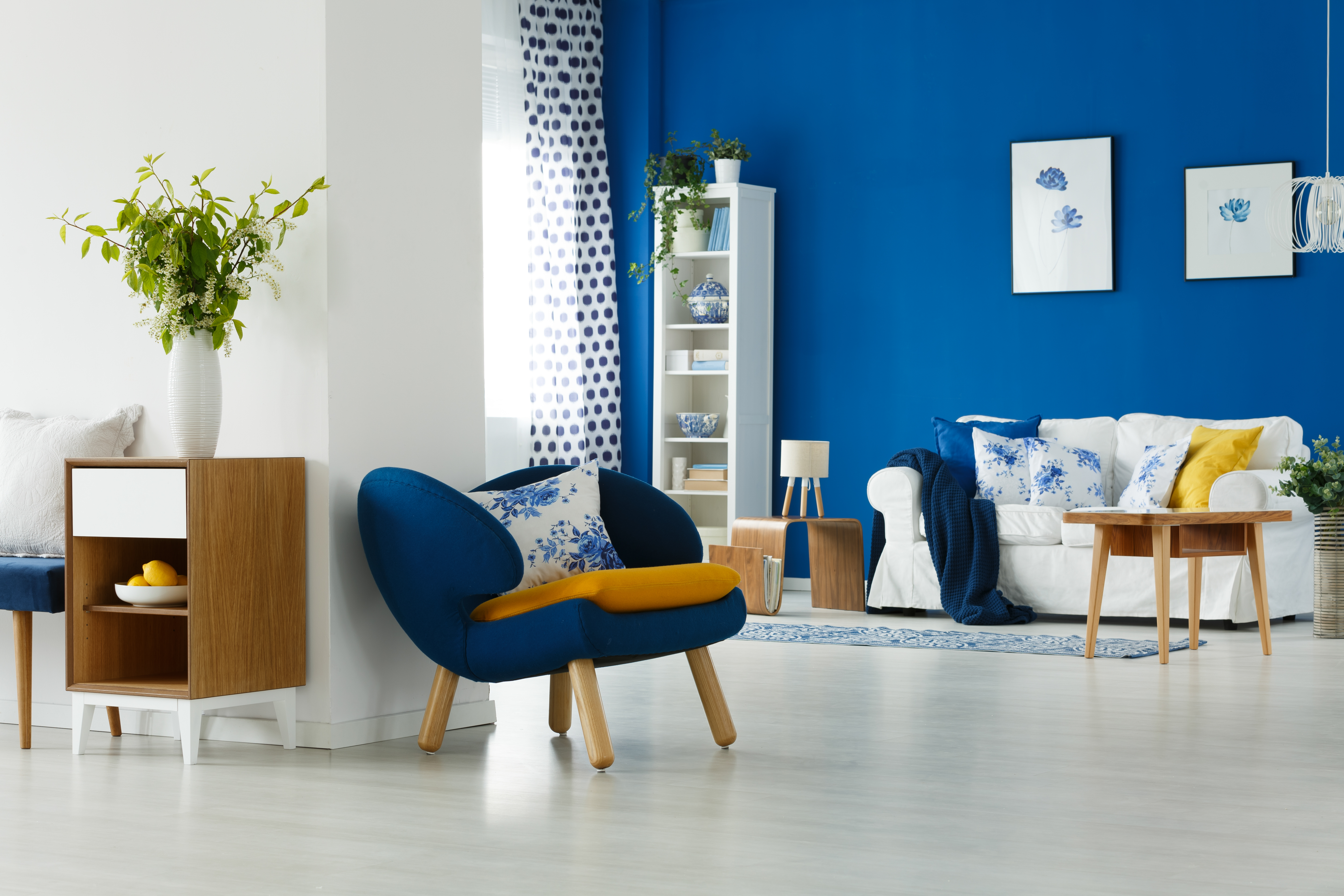
6. Blush Pink and Charcoal Grey
Forget the idea that pink is just for kids' rooms. A dusty, muted blush pink acts almost like a neutral background. When you put it next to a dark, heavy charcoal grey, the room suddenly looks very chic and stylish. It is a highly popular wall colour combination for hall spaces right now for people buying their first homes.
- Make it work: This pairing looks incredible in modern, open-concept spaces. The soft pink walls act as a quiet canvas, allowing a dark, charcoal grey kitchen island or high-gloss wardrobe in the hallway to take center stage.
7. Earthy Brown and Muted Gold
Sometimes you just want your home to look traditional and heavy. An earthy, chocolate brown paired with touches of dull gold feels very royal and deeply Indian. It works best in larger rooms that get plenty of sunlight, otherwise, the brown can feel a bit heavy.
- Make it work: You need heavy, statement woodwork for this to make sense. A massive, floor-to-ceiling wooden TV unit or a custom display cabinet with warm backlighting fits perfectly into this rich, traditional aesthetic.
8. Classic Black and Pure White
Black and white is as simple as it gets, but it makes a massive statement. It looks clean, focused, and very modern. The challenge in India is that black walls show dust very clearly, so you need to be ready to wipe them down occasionally.
- Make it work: Do not paint the whole room black. Use black for a single feature wall. Against this stark contrast, our minimalist, floating LCD panels or high-gloss white built-in storage units look incredibly sharp and architectural.
9. Lavender and Off-White
If you live in a hot city, you might want your living room to visually cool you down when you walk in. Lavender is a very soft, cool tone that feels breezy and light. Paired with off-white, it makes a small room feel much bigger than it actually is.
- Make it work: Keep your built-in furniture light. Avoid heavy, dark mahogany woods and opt for light ash wood or even frosty white laminates for your wardrobes and display units to add to that light, airy feeling.
10. Sage Green and Peach
This is a fun, youthful pairing. Sage green is very soft, and peach adds just enough warmth without being loud like red or orange. It is a great choice if you want a room that feels happy and welcoming but not overwhelming.
- Make it work: This wall colours combination for hall designs works well with contemporary, handle-less cabinetry. A sleek, minimalist TV unit in a soft matte finish will blend right into this lively and welcoming aesthetic.
Read More: Modular Kitchen Color Combination Ideas That You Need to Know
Practical Tips for Your Colour Combination in Hall Layouts
Picking the color is only half the job. Before you hire a painter, you have to test how the color behaves in your specific house so it doesn't clash with your expensive furniture.
First, look at your lighting. Indian homes usually have a mix of natural sunlight during the day and warm yellow LED lights at night. A grey wall might look perfectly neutral at 2:00 PM, but under a warm LED tube light at 8:00 PM, it might suddenly look purple or muddy. Always buy a small sample box, paint a patch on the wall, and check it at different times of the day.
Second, think about the size of the room. If your hall is narrow, stick to the lighter color combinations like lavender and off-white. Light colors reflect light and make walls feel further away, which is crucial if you are installing large, built-in units like an LCD panel or a hallway wardrobe that take up floor space.
Connecting the Living Area to the Rest of the House
Most modern apartments today have open floor plans. Your living room probably sits right next to your dining area, and from the sofa, you can probably see straight into the kitchen. This means your wall colours combination for hall spaces cannot clash with your major woodwork, especially your kitchen cabinets.
If you are planning to upgrade your cooking space, this connection becomes the most important design decision you will make. If you are looking for a new modular kitchen in Gurgaon, you must remember that the acrylic or laminate finishes on those cabinets act like giant blocks of colour visible from your living room. If your hall is painted blush pink and your kitchen cabinets are bright red, the entire house will look messy.
When clients browse our Indian Kitchen Design Photos for inspiration, we always remind them to look at the whole picture. The best modular kitchen manufacturers in Gurgaon know that the kitchen does not exist in isolation. Before we start designing your kitchen, we will consider the paint colours you have chosen for your hall. If you have a teal-and-white living room, we might suggest a frosty-white kitchen with subtle lighting to tie the two rooms together. Always finalise your hall paint before you lock in the laminates for your open kitchen or living room wardrobes.
How Urban Design Co. Completes Your Vision
At Urban Design Co., we do not paint your partitions; we design and construct the structural woodwork that turns an empty painted room into a fully purposeful, luxury home. You pick out the best colour combination for hall walls, and we step in to design the Kitchens, Wardrobes, custom LCD Panels, and Vanity Designs that match seamlessly into those surroundings.
Paint sets the mood, but custom cabinetry defines how you without a doubt stay in the area. We study the herbal mild hitting your windows and the colours you've chosen to your walls, and based on those facts, we advocate finishes and laminates that clearly work. Whether we are building a big media wall in your living room or designing a modular kitchen that opens up into your dining area, we make sure the timber tones, acrylics, and hardware perfectly suit the culture you started with.
Conclusion: Let's Build Your Dream Space
Your living room is the backdrop of your daily life. Whether you decide to go with moody navy blue, cool olive green, or sharp black and white, finding the right colour combination in hall spaces is the first big step in your home journey.
But once the paint dries, the real work begins. You need custom furniture that respects and complements the wall colours. As a trusted modular kitchen manufacturer in gurgaon, Urban Design Co. is here to help you finish the job. We create the Kitchens, Wardrobes, and LCD Panels that turn a nice-looking room into a luxury living space. Explore our portfolio today, and let’s start planning a home that looks exactly how you’ve always imagined.
Frequently Asked Questions
Q1 Which colour is best to make a small hall look bigger?
Light, cool tones like off-white, gentle grey, or pale lavender reflect the most light to make compact areas feel open right away.
Q2 How many colours should I integrate in my residing room?
Follow the 60-30-10 rule by way of deciding on one main base colour, one secondary colour, and a 3rd formidable accent to hold the room flawlessly balanced.
Q3 Can I use dark paint hues in a standard Indian condominium?
Dark sun shades, like military or terracotta, look lovely; however, they should be limited to a single accent wall so the room does not feel like a cave.
Q4 Should my corridor ceiling match my wall colours?
It is commonly preferred to colour your ceiling a crisp, flat white because it creates a phantasm of top and bounces natural light across the room.
Q5 How do I fit my hall paint with an open modular kitchen?
Pick one accent tone from your dwelling room palette and convey it into the kitchen through cupboard laminates or backsplash tiles to connect the areas seamlessly.